Web developer, UX Designer, Digital Marketing.
“Hey Apaar! How can we effectively optimise the digital space to increase our brand’s awareness so that we can get more leads?”
Mast Service Station, an offline tyre business, is facing challenges in attracting online customers, and effectively showcasing their products and services. The business lacks a cohesive brand identity and struggles with low visibility on social media platforms.
“There is a need for a comprehensive UX research, website design/development and web presence solution to enhance the online presence to increase customer engagement and reach of Mast Service Station.”
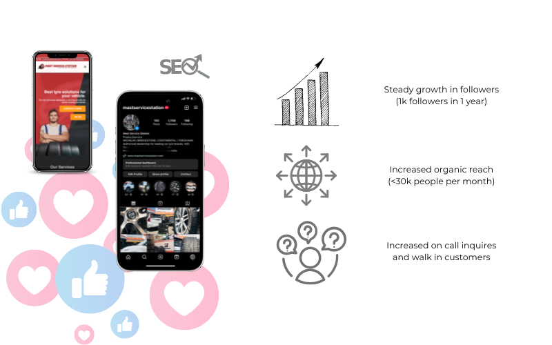
An SEO-optimized website was developed, accompanied by the setup and optimisation of social accounts along with Google solutions, resulting in a steady growth of followers and increased brand visibility for the dealership. This case study highlights the strategies employed and other positive outcomes achieved for the business.
Lets break this down further.
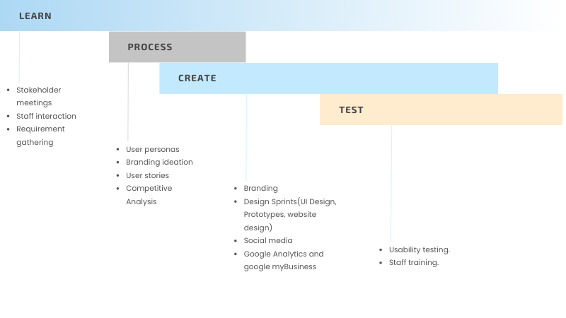
Before conducting the user research, I scheduled a staff and stakeholder meeting with the aim to gather insights about the requirements for the project and evaluate the current branding, marketing and online scenario of the business. The outcomes were as follows:
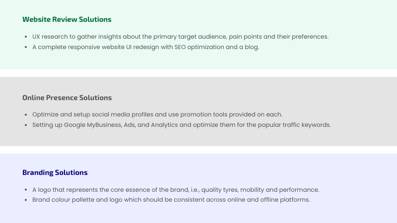
After surveying the current processes and gathering insights, i assembled a report with key insights and recommendations which i would like to address in order to achieve the goal.
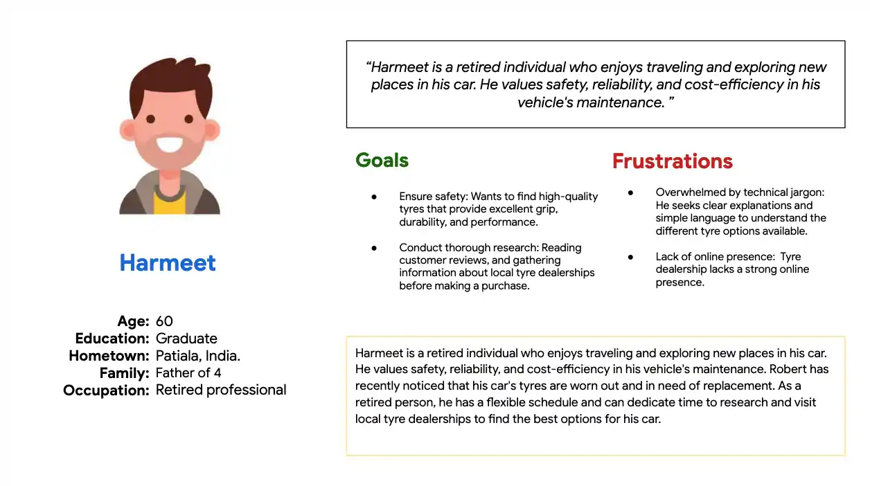
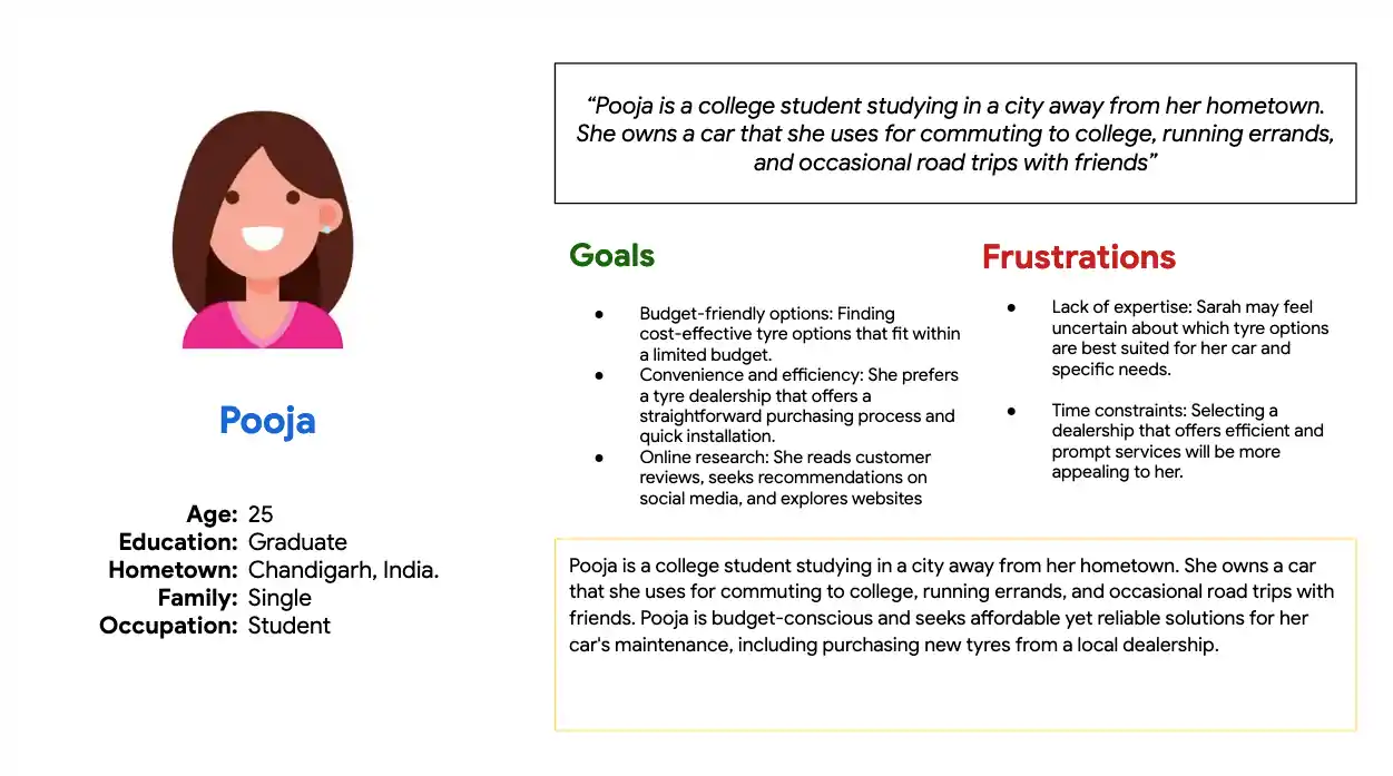
To gain insights, customer interviews were conducted to gather firsthand feedback on their experiences, challenges, and expectations when it came to purchasing and servicing tyres.
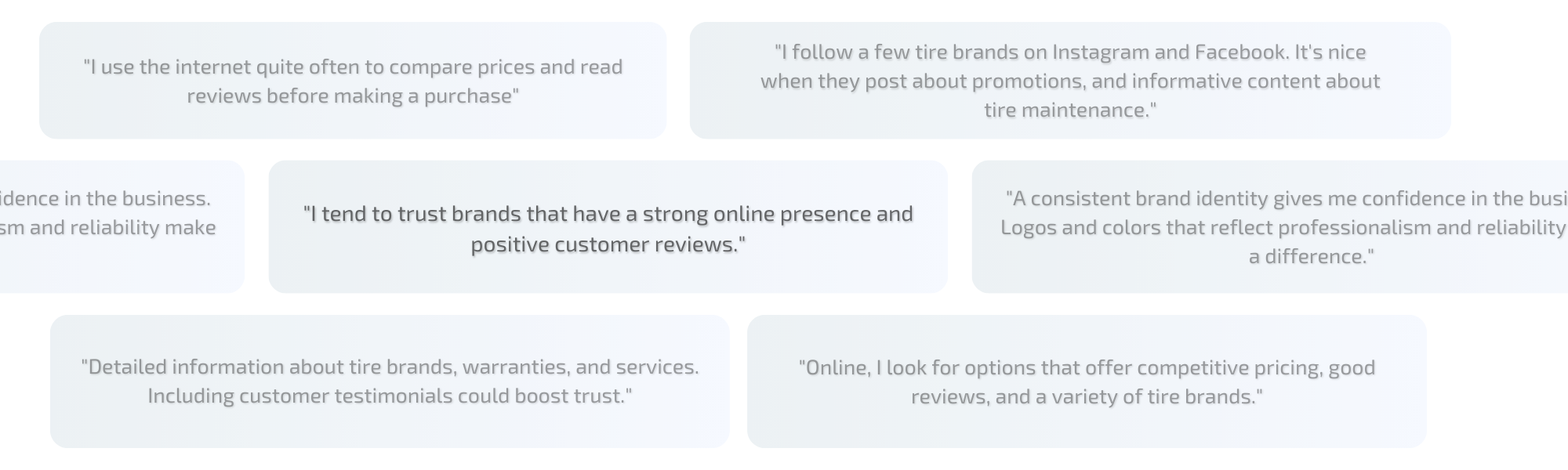
These interviews helped identify common pain points and informed the creation of user personas, which represented different segments of the target audience. Based on the research findings and user personas, the UX design team used Figma, a collaborative design tool, for wireframing and prototyping.
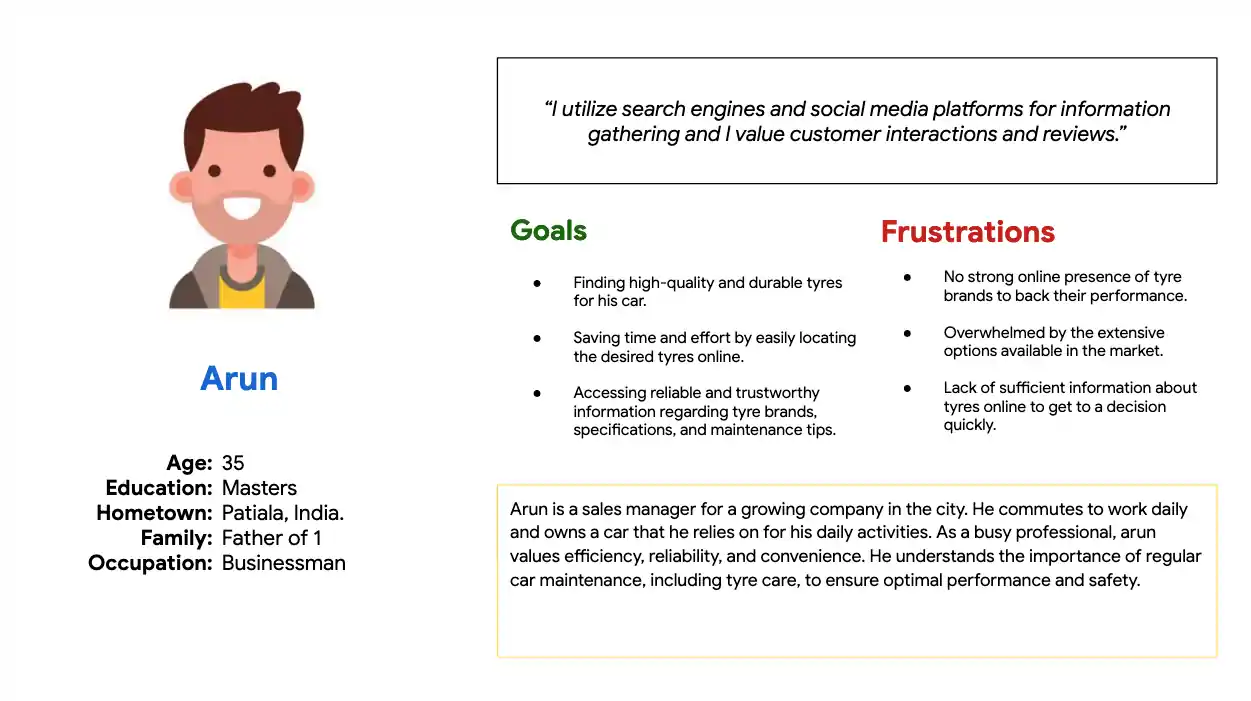
The user interviews and personas were kept at the center and informed our decisions while carrying out any kind of developments in the projects. Be it branding, user interface design, development or marketing. This allowed for the creation of user-friendly interfaces that addressed the identified pain points and catered to the specific needs of different user segments.
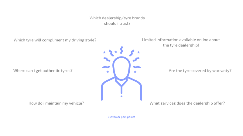
How did we overcome these pain points? Lets dig into that
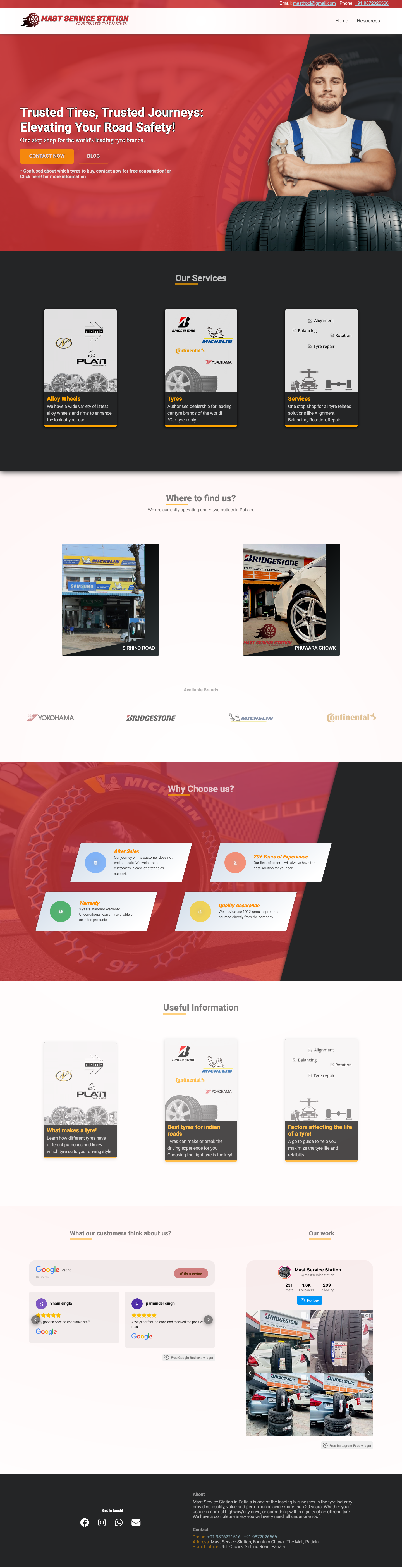
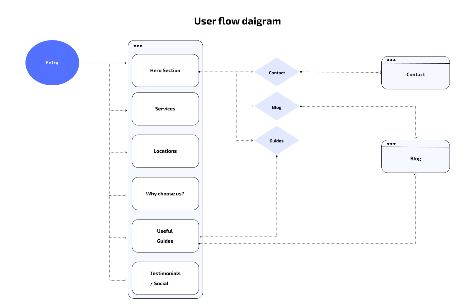
While creating navigation, labelling and structuring the content on the website, i used the “customer first approach” which was informed by the research phase and only included the things that the customers need to prevent cluttering of information on the website.
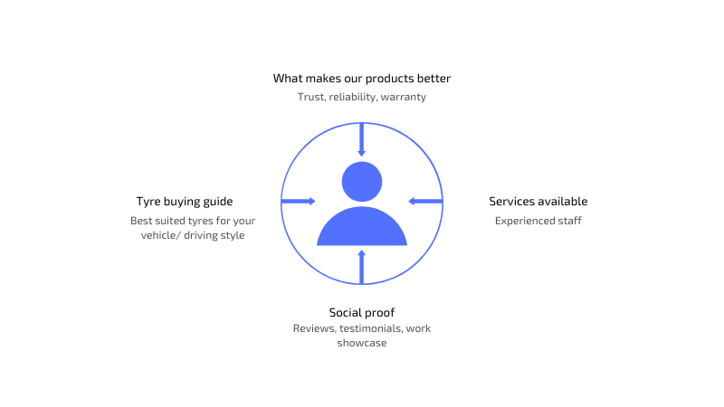
Based on the information acquired from the customers, the features that I identified to showcase on the website were:
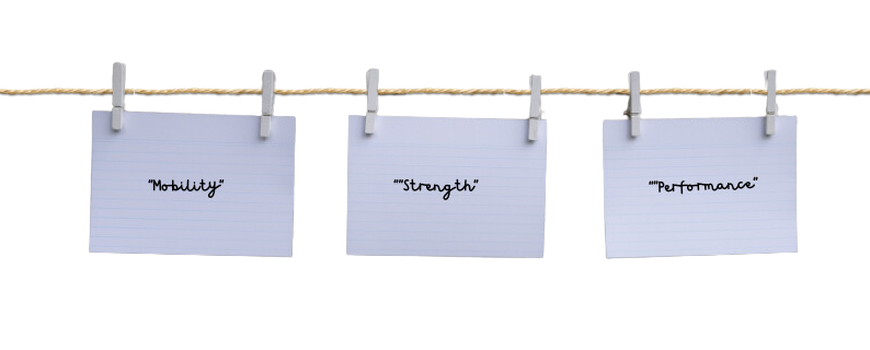
Our journey for branding began with a simple question: What defines the business? To answer this, we convened with our stakeholders – individuals whose insights were integral to shaping the brand identity. With each stakeholder conversation, a tapestry of ideas emerged. We delved into the core values we stood for and the emotions we wanted to evoke. It was during these meetings that the synergy between 'Mobility, Strength, and Performance' became increasingly apparent.
The logo design idea is to feature a stylised tire and wheel icon which is shown to be moving forward with fire on the left, symbolising mobility, strength, and performance. The logo design incorporates elements that represent the core essence and value of the brand. Below are the selections that were made for the logo:
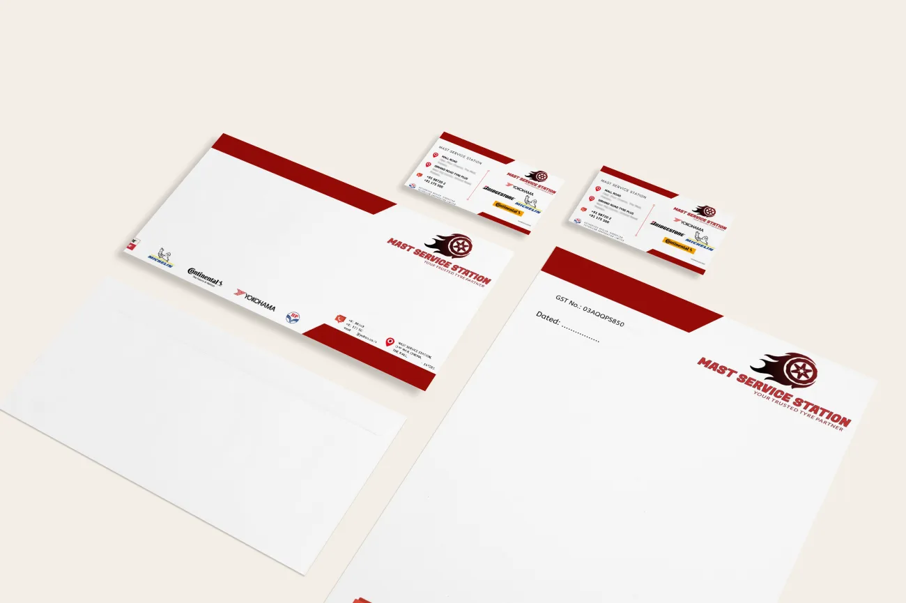
The visiting cards, letterheads, envelopes, receipts and other office material follows a modern minimalistic design approach which clearly shows the important official information of the business. A logo provides consistency and coherence across different digital channels like social media, website, advertisements, etc. with the aim of aligning with the dealership's brand identity and provide a positive user experience.
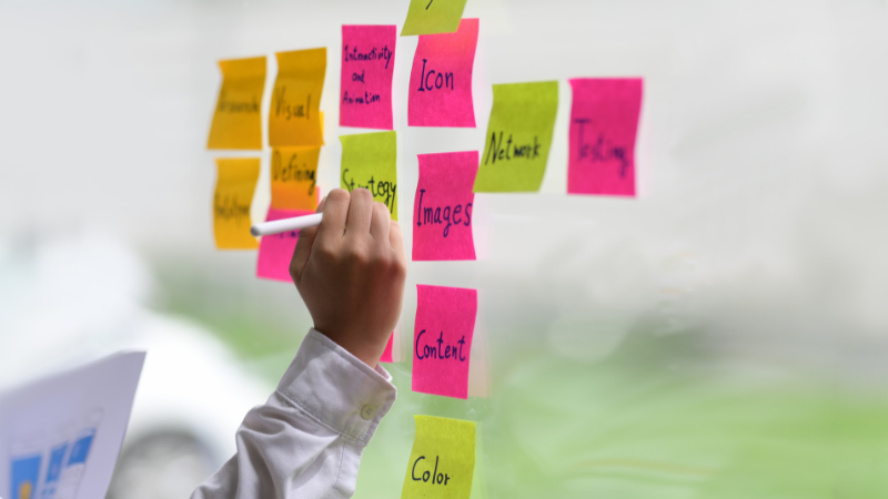
In the pursuit of excellence, we embraced the power of design sprints – a symphony of innovation, strategy, and meticulous planning. I proudly led the charge in orchestrating these sprints, ensuring each step resonated with purpose. The process might lack a visual spectacle, but its impact is monumental. It's the mix of boundless dedication, transforming abstract visions into tangible milestones.
During the design process, careful attention was given to the website's information architecture, ensuring that content was logically organised and easy to navigate. Clear and intuitive user flows were created to guide visitors through the site, making it effortless for them to find information about tyre products, services, and contact details.
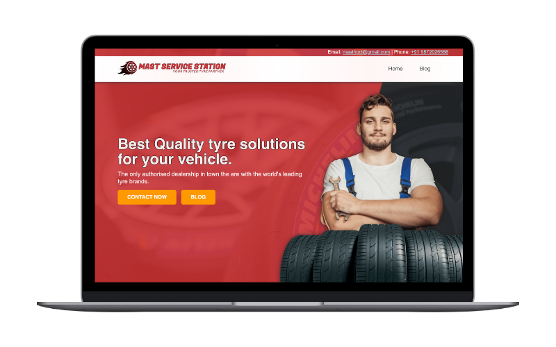
Responsiveness was a key consideration during the front-end development process. The website was designed and developed to adapt seamlessly to different devices and screen sizes, providing a consistent user experience across desktops, laptops, tablets, and mobile devices.
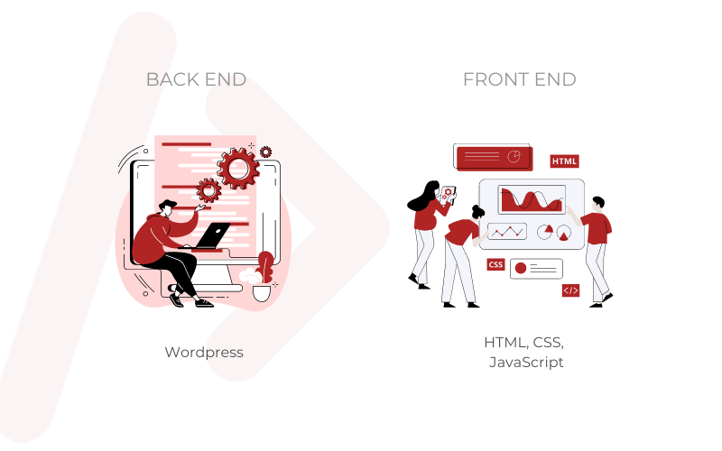
Front-end development focused on implementing the visual elements and interactivity of the website. The UX design provided the foundation for the front-end development, with careful attention given to translating the design into clean and well-structured HTML and CSS code. This ensured that the website's layout, typography, and color scheme were optimized for both aesthetics and user experience.
Back-end development involved the implementation of the WordPress CMS to facilitate content management and website maintenance. This allowed the Mast Service Station team to easily update and add content, such as product information, blog posts, and customer inquiries, without requiring technical expertise. The WordPress CMS also provided robust security measures to protect customer data and ensure the integrity of the website.