From supplier-branded to self-owned: brand, UX and web for a tyre dealership
Customer research, personas and a rebuilt identity took a 30-year tyre dealership from a supplier-branded template site to its own brand and web presence, in use on the storefront, the stationery and the web since 2021.
UX, brand and web · Mast Service Station · 2019 – 2021 · in daily use since
Discovery: the brand belonged to the suppliers
Because I worked close to the business, every decision had to survive daily reality, not just look good in a case study. The issue was not that the business lacked trust offline. It was that the trust was trapped at the counter, while online the business was hard to tell apart from the brands it sold.
Before touching design, I ran stakeholder and staff interviews to survey the current state of the business's branding, marketing and online presence.
The findings were clear. The website was an information-only template supplied by the tyre brands the business sold, so it worked harder for them than for Mast Service Station. Online, the business existed mainly as listings on JustDial and IndiaMART plus a couple of quiet social pages. Offline followed the same pattern: the visiting cards, envelopes, receipts and letterheads came from the partner brands and led with them.
Thirty years of walk-in trust, and little identity of its own anywhere a customer could find, remember, or return to.
The findings went into a written report of key insights and recommendations before any design started. The case for change, on paper, agreed with the stakeholders.
"I ran this end to end: research, identity, information architecture, build, and handover. The brief was to give the business a presence it owned, not one borrowed from its suppliers."
Research: twenty conversations at the counter
I interviewed around twenty customers, mostly at the counter while they waited: notes on paper, patterns on repeat. The questions were simple: what triggered the purchase, how they chose where to go, what they worried about, and where they would look before trusting a shop.
The answers kept converging. "I tend to trust brands that have a strong online presence and positive customer reviews." "A consistent brand identity gives me confidence in the business." "I follow a few tyre brands on Instagram. It's nice when they post promotions and maintenance tips."
Those interviews became three personas, built in Figma: a budget-conscious student who researches everything online before spending; a time-poor professional who wants reliable information without the jargon; and a research-heavy retiree with time to compare, who trusts reviews and plain language. The personas weren't a deliverable to file away: every decision that followed, in branding, information architecture, interface design and marketing, had to trace back to one of them.
Information architecture: only what customers asked for
The site structure came directly from the research, with a rule: include only what customers need, and leave everything else out.
Six sections earned their place, each traceable to something customers actually said. Products, services and brands, because "online, I look for competitive pricing, good reviews, and a variety of tyre brands." Reviews and testimonials, because "I tend to trust brands with positive customer reviews." An Instagram feed, because customers already followed tyre brands there and wanted to judge the quality of work for themselves. A blog, because they asked for maintenance guidance in plain language. Locations and Why Choose Us covered the practical questions: where to go, and what warranties and assurance to expect.
Anything that couldn't be traced to an interview didn't ship.
Brand identity: moving the suppliers down the hierarchy
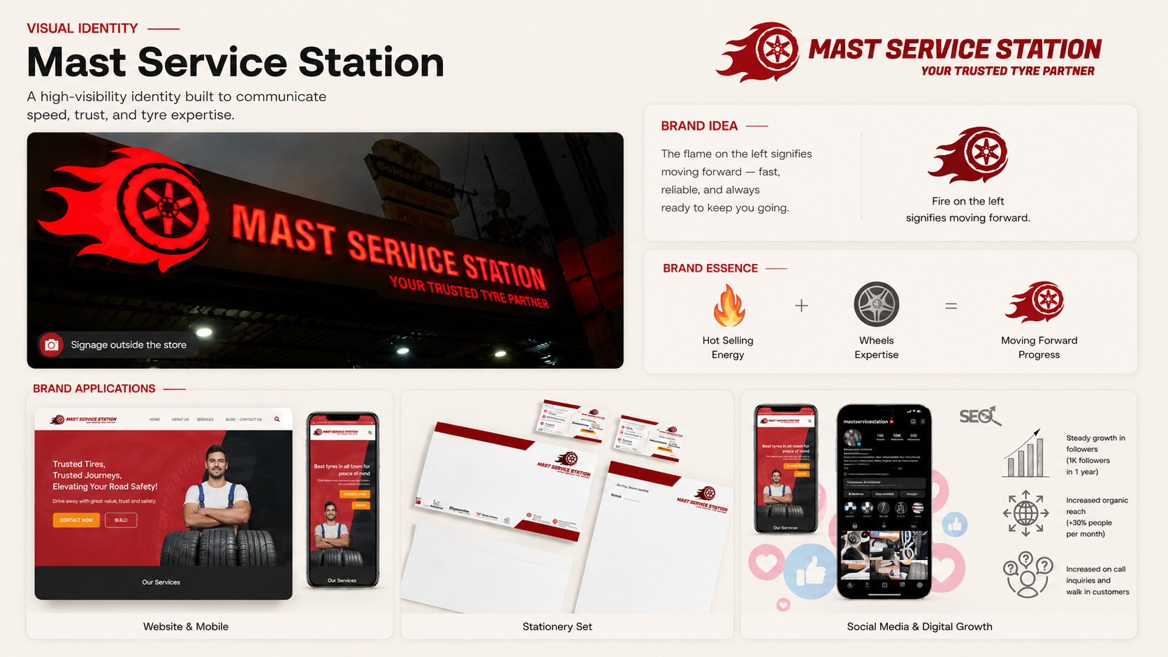
Working from stakeholder sessions on what the business stood for (mobility, strength, performance), I built the identity the business had been missing: a stylised tyre in motion trailing flame, a bold red system chosen for energy and performance, the tagline "Your Trusted Tyre Partner", and Fugaz One for its geometric, kinetic character.
The partner brands didn't disappear. They moved down the hierarchy. On the new visiting cards, letterheads and envelopes, Michelin, Bridgestone and Yokohama appear as credentials under the Mast Service Station brand, instead of the business appearing as an outlet under theirs. Same partnerships, reversed billing.
That hierarchy has already outlived a supplier cycle. The authorised fascia on the storefront has switched before (Bridgestone then, Michelin now) and the Mast Service Station identity carried through the change untouched. The fascia names the current partner; the brand names the business.
Build and handover
I ran the design through sprints (planning, low-fidelity, then high-fidelity prototypes in Figma) before writing a line of code. The front end was hand-built HTML and CSS from those designs, responsive across desktop, tablet and mobile; underneath it, WordPress.
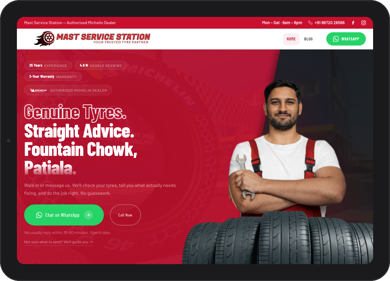
WordPress was a deliberate adoption decision, not a technical default: it meant the team could update products, publish posts and handle enquiries without technical help: the difference between a website that gets maintained and one that quietly goes stale. The site is live at mastservicestation.com.
Testing where the audience was
Rather than bet on one channel, the website and social accounts launched together as a live market test: build presence on both, watch where the results actually came from. Instagram answered decisively.
So we scaled it: past 1,000 organic followers in the first year, above 4,000 with paid amplification the next, 4,100+ today across 560+ posts. The channel became the business's main source of enquiries, many converting at the counter, and opened an online order line that hadn't existed before. The Google Business profile was built from zero over the same period.
The ceiling showed up in the numbers: a single reel (a customer's new SUV outside the shop) drew 593K views, reached 433K accounts, was shared 707 times, and brought in 105 followers on its own.
The clearest result never showed up in a dashboard, though: walk-ins started saying it back to us. "This is that place I saw on Instagram."
The operating layer that kept these promises (records, reminders, follow-up) is its own story: see the service transformation case study.
What the work delivered
A brand the business owns — logo, colours, tagline and stationery that put the business above its partner brands, not beneath them.
Six website sections, every one traceable to a customer interview — and nothing that wasn't.
A responsive WordPress site the team updates without technical help, live since 2021.
A Google Business profile built from zero, now 4.8★ with 500+ reviews.
Instagram as the primary enquiry channel — steady monthly enquiries, counter conversions, and online orders; a single reel peaked at 593K views and 433K accounts reached.
The identity in daily use since 2021 — storefront signage, stationery, and mastservicestation.com.
"Customers trusted the shop. The internet had no way of knowing."